Despite being a heavy user of RSS feeds, the announcement of Google killing their Reader app didn’t affect me much. While I used to use Reader a lot, since I moved to BlackBerry in 2010, I found that the lack of a single good, free RSS reader app that synced to Google Reader forced me to search for an alternative platform. That’s when I discovered BlackBerry News, a Blackberry-designed app that synced with my BlackBerry ID and allowed me to keep up with my favourite blogs and topics – except that it didn’t sync to Google’s services.
But my move to BlackBerry News mitigated my reliance on the Google Reader platform, to the extent that I wouldn’t even login to the service for months at a time.
Since Reader was axed on July 1st, and with the sudden renewed interest in RSS and reader apps, I decided to check out an alternative to Reader, just in case I wanted to stop using BlackBerry News, and also because I plan on moving away from the BlackBerry platform in a few months time and will be in need of a good reader.
That’s when I found out about Feedly. It’s a free, web-based service that is beautifully designed and also has apps for iPad and iPhone.
Feedly uses your Google account credentials to sign in, and allows you to add feeds by categories (so far I’ve got three categories – News, Tech and Business). You can read your feeds in various formats, including a Flipboard-esque “magazine” view.
Feedly has many traces of the old Google Reader design, which means that us veteran Reader users will feel right at home using it. But it’s also got some awesome new additions, such as a “Today” view that creates different “editions” with top stories collated in a beautiful interface.
I’m enjoying using Feedly, and look forward to trying it out on iOS soon.
The Mac has long been famous for its deep focus on human interface design. When Apple introduced the Aqua interface, they made sure to juxtapose it with the “clownish” GUI of Microsoft’s Windows XP. Design is paramount to these guys, and so it comes as little surprise that everything – right down to the default wallpaper – is meticulously sourced or crafted to create the ambience of the overall experience.
The default wallpaper for each edition of OS X becomes the marketing standpoint for that generation of Mac computers. Apple markets their Macs with the default OS X image prominently displayed on product boxes, promotional material and on their website. So users become acquainted with their new Mac (and thus the OS) through the wallpaper at first glance. And besides, Mac’s wallpapers have always been beautiful, and in my opinion, far better than most default offerings found in the Windows world.
Being an Apple aficionado, I decided to investigate the wallpapers of OS X, and see how they correlate to the experience of each iteration of the OS.
OS X: The Aqua Years
The early releases of OS X had a user interface called “Aqua.” Steve Jobs is famous for remarking that the interface looked so good, you wanted to lick it. While I won’t go that far in superlatives, I will mention that it was a very good-looking and well-designed interface. And it was in this era that Apple shipped the blue-hued wallpapers with ambiguous swirls and abstract shapes.
These wallpapers emphasised the fluidity of Aqua’s concept: a glossy, dominantly blue interface.
Here’s a look at the wallpapers of OS X 10.0 “Cheetah” – 10.4 “Tiger.”
10.0 Cheetah and 10.1 Puma
10.2 Jaguar
10.3 Panther
10.4 Tiger
The Leopards: A galactic shift
With OS X 10.5 “Leopard”, Apple shifted their wallpapers to a more “galactic” tone. Leopard featured the pink-tinged “Aurora” wallpaper, which was greatly softened by its power successor, Snow Leopard.
While Aqua still prevailed, it was slowly being tuned down.
10.5 Leopard
10.6 Snow Leopard
The Lions: At the end of the universe
With the Lion and Mountain Lion operating systems (10.7 and 10.8), OS X made a leap into the galaxy: these two iterations had the images of the M31 Andromeda galaxy (Lion) and the NGC 3190 galaxy (Mountain Lion) setting the tone of the OS. More importantly: Aqua was now dead. In its place were UI elements taken from the wildly successful iOS platform (inertial scrolling, skeumorphic elements…). Here, the wallpaper’s celestial theme now alluded to OS X’s new direction, focussing on powering-up the system while taking all that worked on iOS and integrating it into the older desktop code (a task of galactic proportions in its own right – making relevant a system constantly threatened by the young upstart that is iOS).
10.7 Lion
10.8 Mountain Lion
And now, the future: 10.9 onwards
10.9 Mavericks
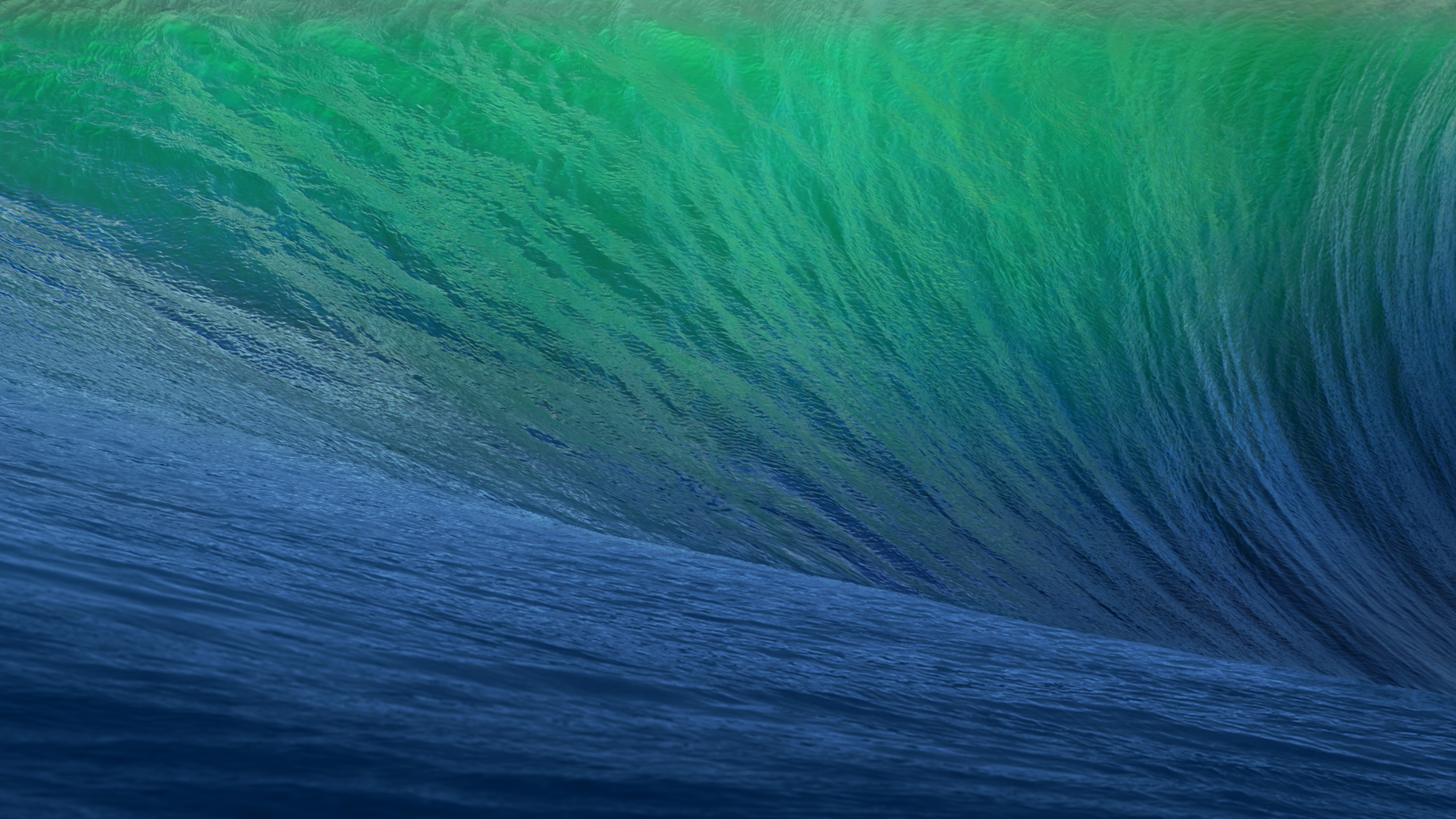
With Mavericks (10.9), Apple’s done some radical changes to OS X. Most importantly: the naming scheme shifts from big cats to famous landmarks in California, the birthplace and development home of the Macintosh operating system. It comes as no surprise, then, that the lead image of the first in this new series of OS X, called Mavericks, has a beautiful green-blue wave – the famous swells of the Mavericks surfing spot that is a paradise for surfers the world over.
One can thus assume that subsequent iterations, each carrying a landmark from California, will be heralded by an image directly related to that name. Gone are the ambiguous, abstract images of the Aqua years. Apple’s rooting their flagship OS, and in so doing, setting the tone of a whole new era for the Mac.
There are three classes of intellects: one which comprehends by itself; another which appreciates what others comprehend; and a third which neither comprehends by itself nor by the showing of others; the first is the most excellent, the second is good, and the third is useless.
– Niccolò Machiavelli
From his book The Prince. I think that in today’s world, we need more of the first class – those who can think lucidly in the face of noise and chaos; those who can think first for themselves, incubate new ideas in their minds and formulate thought independent of the interference of external influence. They will be the ones who will push the human race forward.
I’ve written before about how much I admire the music of films. Not just the soundtracks, but the actual orchestral scores of certain good movies. A film like Star Wars has iconic music that has made the franchise instantly recognisable directly through its sonic vision. On the other hand, Quentin Tarentino’s Pulp Fiction has perhaps one of the best soundtracks to a film ever done – Dick Dale & His Del-Tones’ famous surf-rock guitars straining over the title sequence to the tune of Misirlou contributed significantly to crafting one of the most memorable openings for a film ever.
So I decided to compile here a list of some of my favourite soundtracks and scores to my favourite films. Please share your favourites in the comments, too 🙂
Pulp Fiction
(Dick Dale & His Del-Tones).
Star Wars
John Williams.
Inception
Hans Zimmer.
Slumdog Millionaire
AR Rahman.
The Social Network
Trent Reznor and Atticus Ross.
Inglourious Basterds
Ennio Morricone.
Drive
Cliff Martinez.
The Dark Knight Rises
Hans Zimmer.
What’s your favourite? Share it in the comments below!
I haven’t been posting in a while due to not feeling too well. I hope to get back to a more “regular” schedule soon. Expect my thoughts on the new Superman film Man of Steel (once I actually get to see it), and reviews and musings on the world of tech. But for now, I thought I’d just drop by to update you on some of the things that are keeping me interested whilst I get better.
Book: Dan Brown’s Inferno. I started it earlier this week. Still very early into the story, so I can’t give any proper opinion yet. But I’m enjoying it – classic Dan Brown stuff here.
Music: Still enjoying Daft Punk’s Random Access Memories. Gets better with each listen.
TV Series: since Da Vinci’s Demons ended season 1 (on a cliffhanger, too!) and all my other favourite comedies (Modern Family, The Big Bang Theory, Community) aren’t scheduled to resume until later this year, I’ve found myself drawn to Arrow. Yes, I know, I’m a bit late to the party there, but this series has enough plot twists and intrigue to keep me entertained. The acting is a bit questionable, but it’s a fun watch nevertheless.
Projects: apart from working on the major redesign of the SKKSA website, I’m also learning some new web technologies (though I can’t say much more about that just yet…). Hoping to also get back into the manuscript soon.
Sorry for the lack of posts on Pixelated Thinking. I can’t wait to get back to the regular schedule. See you soon!