
The Mac has long been famous for its deep focus on human interface design. When Apple introduced the Aqua interface, they made sure to juxtapose it with the “clownish” GUI of Microsoft’s Windows XP. Design is paramount to these guys, and so it comes as little surprise that everything – right down to the default wallpaper – is meticulously sourced or crafted to create the ambience of the overall experience.
The default wallpaper for each edition of OS X becomes the marketing standpoint for that generation of Mac computers. Apple markets their Macs with the default OS X image prominently displayed on product boxes, promotional material and on their website. So users become acquainted with their new Mac (and thus the OS) through the wallpaper at first glance. And besides, Mac’s wallpapers have always been beautiful, and in my opinion, far better than most default offerings found in the Windows world.
Being an Apple aficionado, I decided to investigate the wallpapers of OS X, and see how they correlate to the experience of each iteration of the OS.
OS X: The Aqua Years
The early releases of OS X had a user interface called “Aqua.” Steve Jobs is famous for remarking that the interface looked so good, you wanted to lick it. While I won’t go that far in superlatives, I will mention that it was a very good-looking and well-designed interface. And it was in this era that Apple shipped the blue-hued wallpapers with ambiguous swirls and abstract shapes.
These wallpapers emphasised the fluidity of Aqua’s concept: a glossy, dominantly blue interface.
Here’s a look at the wallpapers of OS X 10.0 “Cheetah” – 10.4 “Tiger.”


The Leopards: A galactic shift
With OS X 10.5 “Leopard”, Apple shifted their wallpapers to a more “galactic” tone. Leopard featured the pink-tinged “Aurora” wallpaper, which was greatly softened by its power successor, Snow Leopard.
While Aqua still prevailed, it was slowly being tuned down.


The Lions: At the end of the universe
With the Lion and Mountain Lion operating systems (10.7 and 10.8), OS X made a leap into the galaxy: these two iterations had the images of the M31 Andromeda galaxy (Lion) and the NGC 3190 galaxy (Mountain Lion) setting the tone of the OS. More importantly: Aqua was now dead. In its place were UI elements taken from the wildly successful iOS platform (inertial scrolling, skeumorphic elements…). Here, the wallpaper’s celestial theme now alluded to OS X’s new direction, focussing on powering-up the system while taking all that worked on iOS and integrating it into the older desktop code (a task of galactic proportions in its own right – making relevant a system constantly threatened by the young upstart that is iOS).


And now, the future: 10.9 onwards
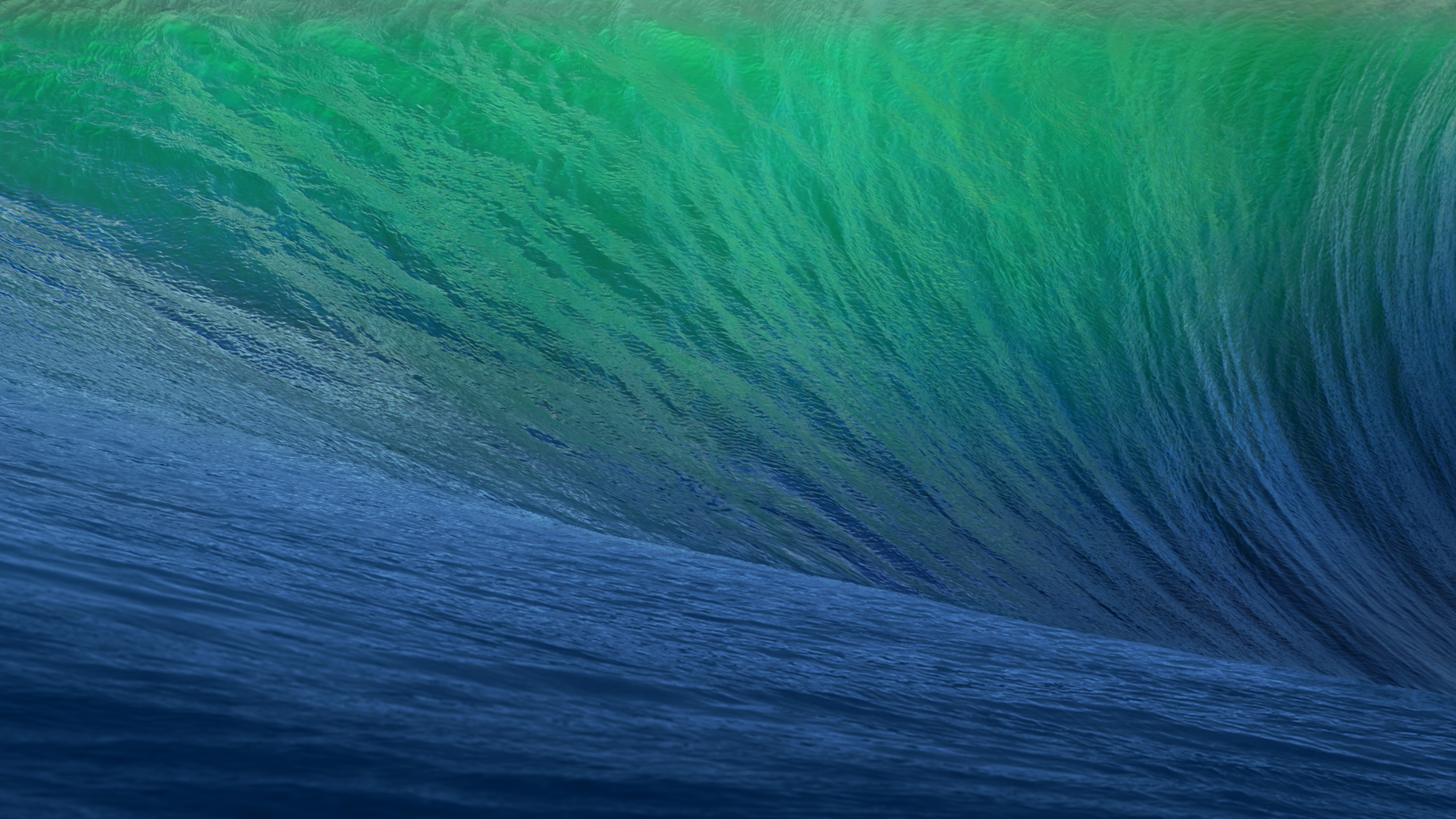
With Mavericks (10.9), Apple’s done some radical changes to OS X. Most importantly: the naming scheme shifts from big cats to famous landmarks in California, the birthplace and development home of the Macintosh operating system. It comes as no surprise, then, that the lead image of the first in this new series of OS X, called Mavericks, has a beautiful green-blue wave – the famous swells of the Mavericks surfing spot that is a paradise for surfers the world over.
One can thus assume that subsequent iterations, each carrying a landmark from California, will be heralded by an image directly related to that name. Gone are the ambiguous, abstract images of the Aqua years. Apple’s rooting their flagship OS, and in so doing, setting the tone of a whole new era for the Mac.

Leave a comment