After a considerable hiatus from publishing short stories on Pixelated Thinking (although I did continue to write a few very short ones that remain unpublished), I’ve finally decided to release a new one (the last short story I published here was The Walker in 2011). This is more of an experimental piece than anything. Since the recent few months have had me preoccupied with completing my first manuscript of a sci-fi thriller I’ve been developing over a few years now, it was nice to venture away from that world and those characters with this more abstract project. Also, I needed something new to write to distance me from that first draft that I know is going to need an insane amount of work to rewrite.
This story is called The Drifter. It’s an experiment into a darker-tinged, fantasy-sci-fi dystopian world, something I haven’t actually written before. I think it serves as a nice threshold between my first 45 000+ word manuscript that’s occupied my mind for years now, and a new crime/noir/thriller drama I’m in the early stages of developing into a novel.
Here’s a preview of The Drifter. The story is complete, by the way, and sits hidden away on my MacBook’s harddrive. I will release the full 1000+word story soon, so look out for it on this blog and @RahulDowlath.
*
THE DRIFTER (a preview)
The Drifter had walked these roads before. He had been subjected to this hell of placelessness, namelessness, facelessness… he moved like a dark shadow across the grey landscape, gliding like a phantom through these parts.
The towns he passed looked the same: single roads, dusty streets, broken windows in falling-down buildings. An empty existence. All because of the One.
The One who had started it all.
The One who he tried to stop.
The One for whom defeat was never a word.
The One.
A shiver crept through the Drifter’s thin frame, rattling his very being. He stopped.
The town lay before him, just like the countless others he’d experienced.
But there was something different about this one… something he couldn’t quite place just yet.
A single street, flanked by crumbling structures.
Dust billowing in the afternoon gust, the buildings bathed in dusk’s golden light.
*
Look out for the full version of The Drifter, coming soon to Pixelated Thinking.
Robert A. Heinlein, a popular (and controversial) science fiction writer, on what a human being should be capable of doing:
A human being should be able to change a diaper, plan an invasion, butcher a hog, conn a ship, design a building, write a sonnet, balance accounts, build a wall, set a bone, comfort the dying, take orders, give orders, cooperate, act alone, solve equations, analyze a new problem, pitch manure, program a computer, cook a tasty meal, fight efficiently, die gallantly. Specialization is for insects.
– Robert A. Henlein, Time Enough for Love (1973) p.248
So this morning, after trawling Google Image search for a cool, minimalist wallpaper to use on my iPad and iPhone, I just decided to create one myself. Well, more like use elements I found across the web to create my own wallpapers. I wanted to go for an aesthetic reminiscent of the cinematic version of Catching Fire, with a carbon-fibre backing to the ubiquitous Mockingjay symbol.
(Disclaimer: these are in no way related to Lionsgate or the Hunger Games franchise; they’re merely my tribute – see what I did there? 😛 – to what I think is a great series).
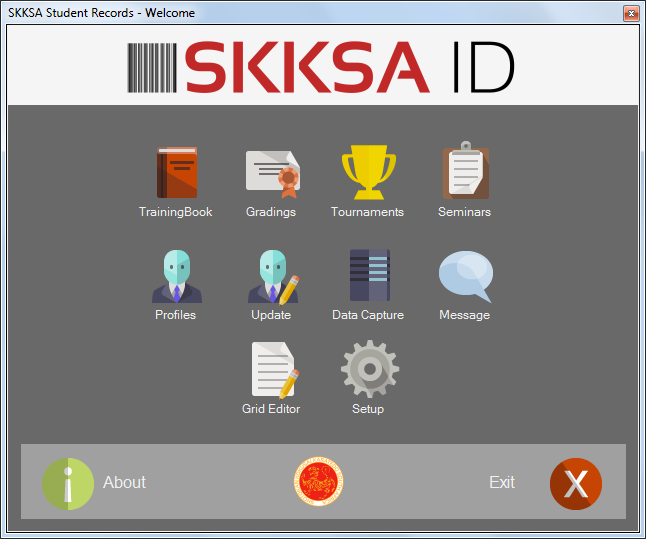
Osaka’s “Welcome Screen” which displays the various things you can do with the software.
Osaka is a new software system I designed and coded in December 2013/January 2014 to significantly overhaul the SKKSA admin system and update the existing software architecture (which had been conceived as a modular design in June 2012, and had been in use ever since).
It replaces an app called “Nexus” which had been showing its age, and which desperately required an integrated philosophy to ensure scalability and enable a critical new feature – the Student Profile.
The Technologies
Three major technologies were used to create Osaka:
Visual C# (programming language/environment)
Microsoft SQL Server Compact Edition
MySQL Workbench (to design the database architecture)
C# is a language I’ve been using for some time now. I’m comfortable with it, hence I chose it as the best and most efficient way of undertaking this considerably complex project. Say what you want about Microsoft, but their developer tools are great. Visual Studio was an excellent IDE to design Osaka’s UI, and execute the entire project – from bringing the interface to life with UX code, to linking the screens to the database backend.
The Project
Osaka was a big step up in SKKSA’s digital systems. When we introduced SKKSA ID with the Nexus app back in 2012, we were one of the few karate organizations in South Africa to have a digital student database. Barcoded student numbers could be used to scan-in to sessions and validate registration for a seminar. But it was still very limited in its capabilities. My ultimate goal was to have a holistic solution that captured a student’s entire karate record in a single place.
Thus arose the idea of the Student Profile. A single screen could display the selected student’s records for their tournaments, gradings, Saturday senior training attendance, seminars and affiliations. This would go along with their contact info, and data central to their karate life – i.e. their dojo affiliation, current grade and SKKSA ID (their student number).
Design began with the welcome screen. I mocked-up a basic UI, and then decided what elements were critical to Osaka’s initial release. However, due to logistical reasons – me being in Cape Town and the software being in use in Durban – the development process required me to design the initial release with as many critical features as possible to avoid potential usage problems down the line.
At its heart, Osaka is really a dataset with various tables linked to each other. Each table holds data specific to a part of the student’s profile – there’s a table for their gradings, their affiliations, their tournaments etc. This all ties into the “primary” table, the “Students” table. Then there’s various other tables that hold data about seminars – seminar names, locations, dates; Saturday training – dates etc. It was complex to think about, and so I resorted to designing the dataset using, first, pen and paper (very tech-savvy, I know :P), and then migrating those initial sketches to MySQL Workbench, where I mocked-up the dataset’s tables and relations. This allowed me to see what the overall database would look like.
Designing the UI
From there, things started to get very messy. Moving over to Visual Studio, and armed with the database design, I began building the user interfaces. I chose to go with as simple a UI as possible given the time constrains. Designing for simplicity is actually really complex. I believe that the more pedantic you are about designing things and the more work you put in, the simpler the overall result will be. So with Osaka, I wrote many lines of code for the most mundane things, like automatically moving the cursor to the next textbox once a student’s ID number is captured, and using their ID number to automatically write their date of birth. In the end, these little things save a lot of time when it comes to capturing registration forms.
I attempted to tie SKKSA’s new brand image into the software. The organization’s primary colours – deep red, gold, silver, white, grey – were the basis for the colour palette. I ended up using a third-party designed icon set to minimize design time.
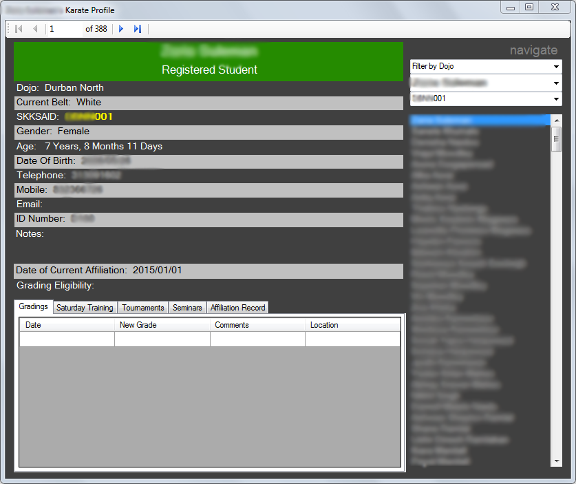
In future updates, I hope to focus more on making the UI design even simpler. The Profiles screen is my next focus, and I want to change the cluttered look into something cleaner, readable and information-rich without any complexity. This is what the Profiles screen looks like with Osaka 3.0.2: (certain info blurred for obvious reasons…)
Osaka’s Profiles screen
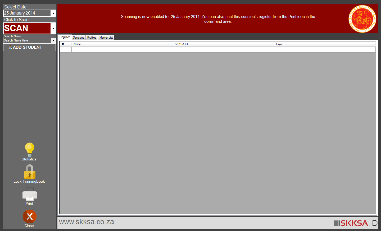
The most critical feature, though, was the TrainingBook module. This system replaces the traditional pen-and-paper register. Now, students just scan their cards, and their name is automatically added to the day’s register and to their profiles. TrainingBook was perhaps the main reason for designing Osaka. It’s where a lot of the development focus rested, and its UI inspired other aspects of the software, including the new Seminar module which functions almost exactly like TrainingBook, but for training courses instead.
TrainingBook ready to scan student cards.
Registers can be printed on a daily basis.
With an all-digital register, lots of interesting data can be extracted. While Osaka alone can’t manipulate data and provide in-depth analysis, by exporting the lists to Excel as CSV files, reports can be compiled for the instructors so they can chart their students’ progress.
Next Steps…
Osaka, like any software project, is not complete. Nor do I think it ever will be. But in its current state, it’s already significantly more powerful and feature-rich than anything we’ve had before. I’m really interested to see how it will be used; from that, I can begin mapping out the software’s future and next feature set.
And then there’s the next project I’m contemplating: an online web portal for instructors first, and then students. While Osaka is not in any way connected to an online web service, this website would take periodically exported data from Osaka and make it available as a personalized online profile page for each student. I’m still in the earliest stages of planning that project, but I know it will be based in PHP, use MySQL as a backend, HTML5 and the Twitter Bootstrapper for front-end design and UX, and in its first iteration will be exclusive to the instructors. It’s an exciting project – my first “Web 2.0” (if they still call it that) project.
Student Card Design
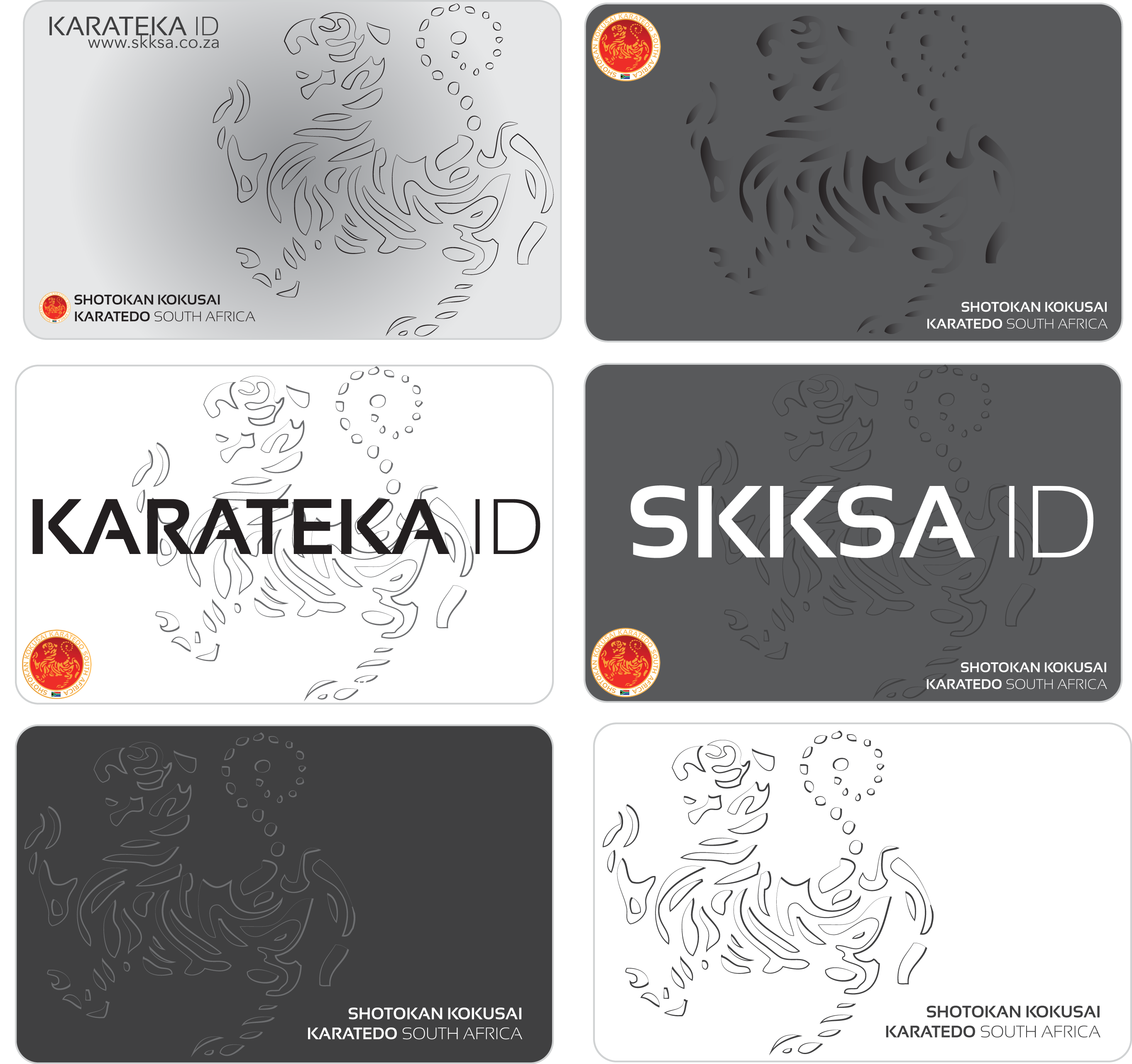
Along with the new software, I designed a new student card that again tie this new design aesthetic of SKKSA with their new digital systems. Here’s a collage of the initial designs:
Six designs were tested for the new student cards.
The challenge with designing the new student card was that it needed to succinctly convey SKKSA’s identity, whilst also remaining functional and eye-catching. A bold design would mean that the SKKSA ID brand image was powerful, and a noticeable object that would distinguish it from other documentation a student might carry to training or tournaments. In the end, a design similar to the fourth card above was chosen. And instead of grey (which I initially chose to be subtle and “professional-looking”), I went with a deep red and radial gradient that framed the famed tiger graphic. It’s simple, bold and carries the new SKKSA aesthetic.
“Words are, of course, the most powerful drug used by mankind.” – Rudyard Kipling.
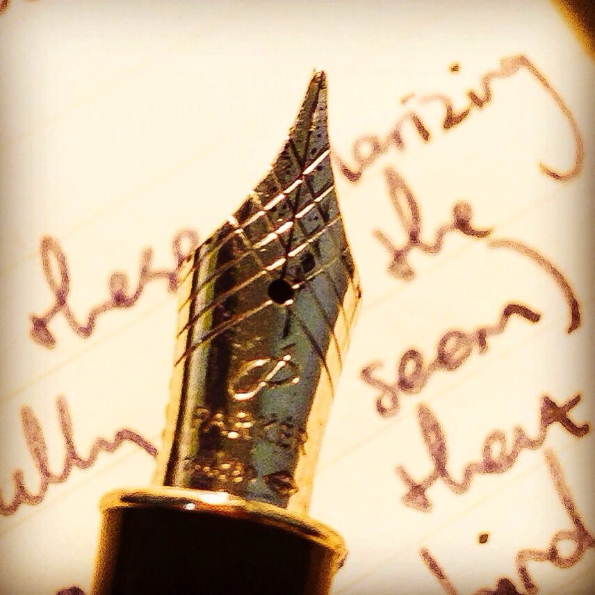
Took this macro (of sorts) photo last night while inking some thoughts on cities and design and the opinions of opinionated human beings. I’m on Instagram, by the way: http://www.instagram.com/RahulDowlath




 Rahul Dowlath